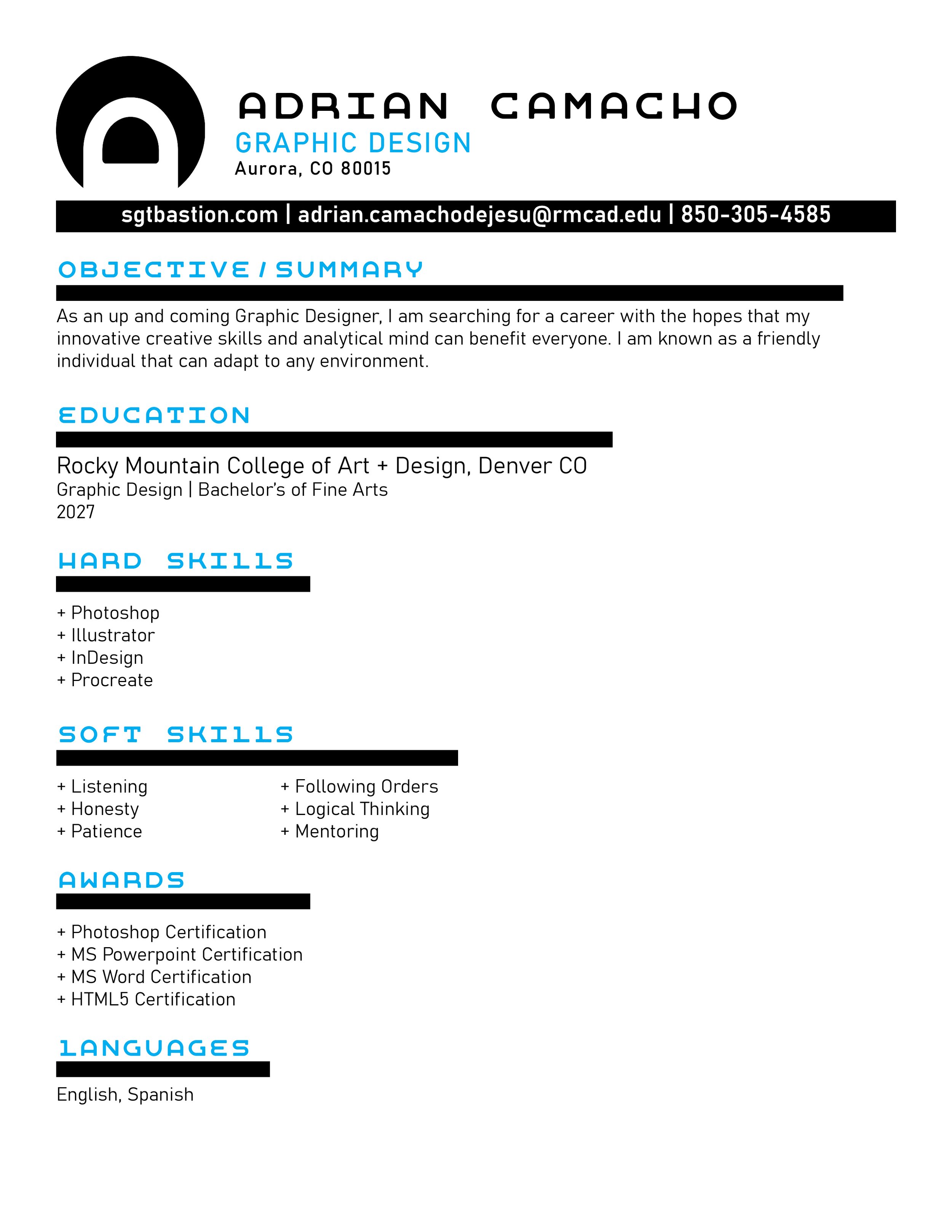
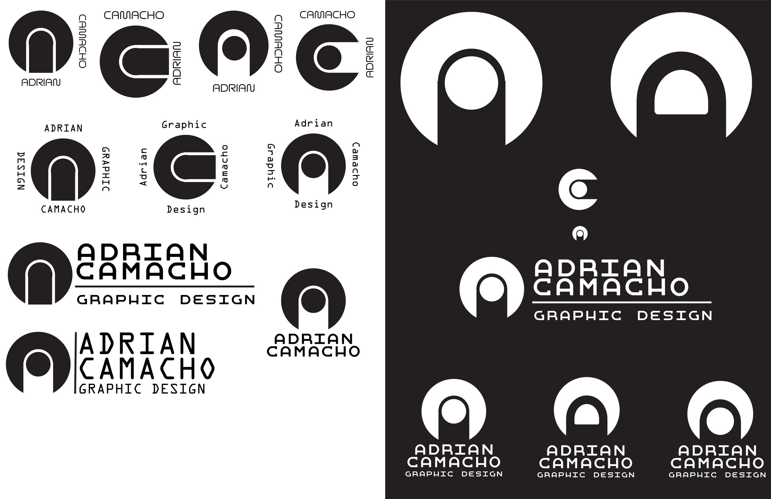
The logo I currently use went through a number of variations. In the end, I was able to create a unique looking monogram that I was satisfied with.
Brand Identity
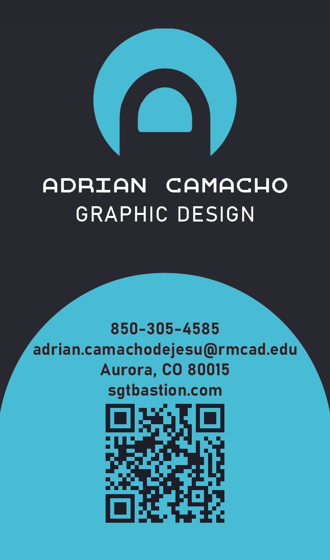
When it came to my brand identity, the most important aspect for me was to have it be cyan on black. I have been using this color scheme to represent myself for many years now.
The symbol used in my logo is a monogram that implements both the A and C in my name. Regular monograms were not pleasing to me so I went with a look that was more “sci-fi“.
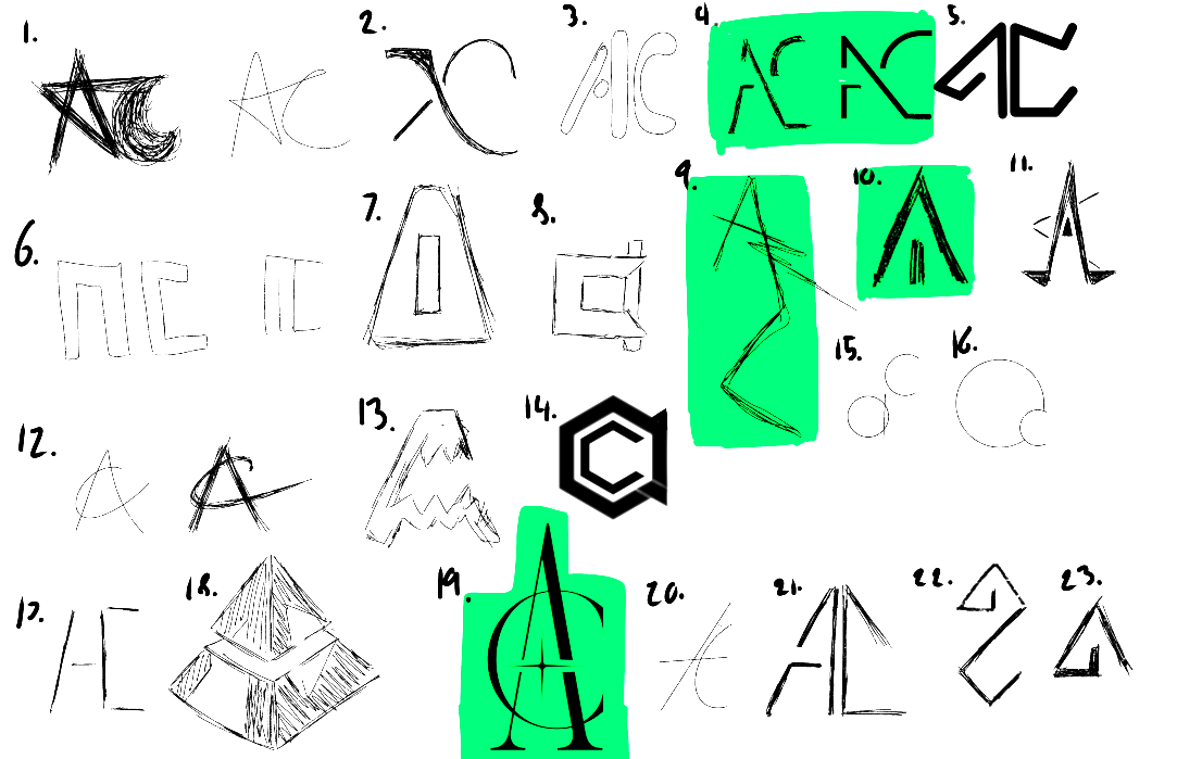
EarLy Designs
I had tried out a number of ways to put together a monogram for my logo, in the end none of them felt right to me.
It was when I began trying going away from a monogram that I actually found a path to the end.
BUSINESS CARD
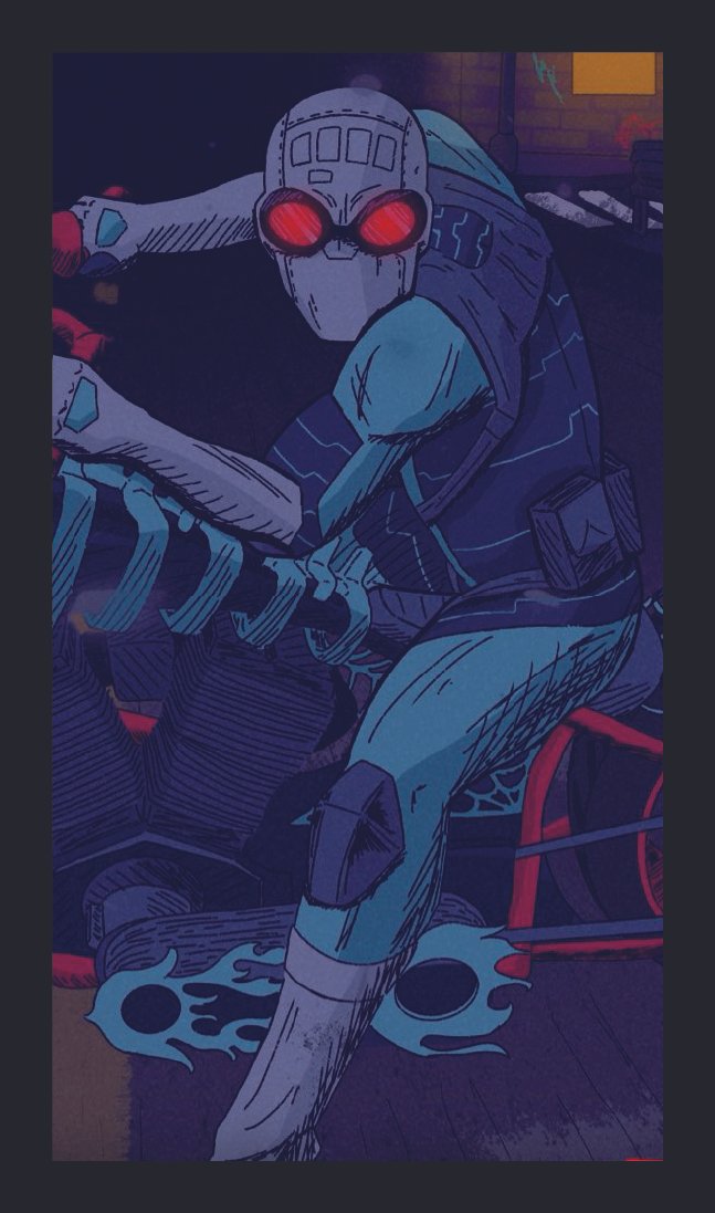
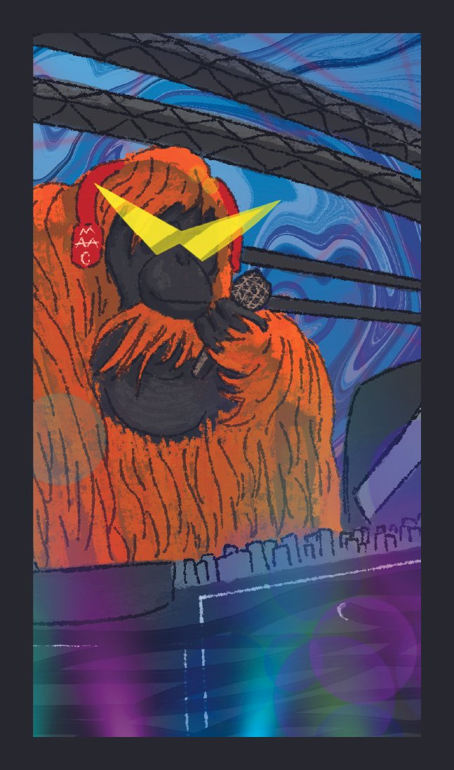
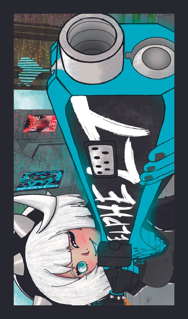
The goal of my business cards is to provide an sample/preview of my work that people can take with them.
Letter + Resume